Contract Work
KidzCard Bank App Case Study
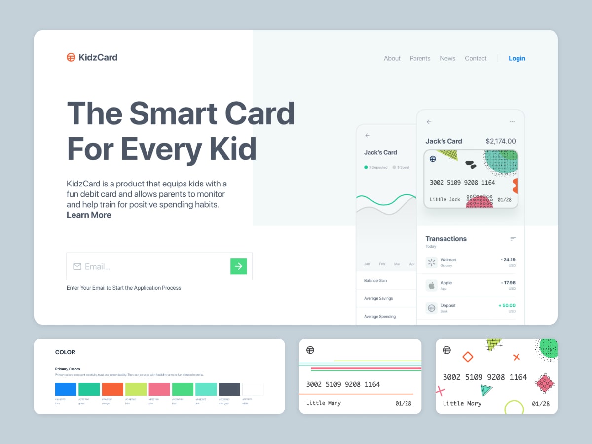
The KidzCard bank app helps parents analyze their children's debit card use and collect data necessary to educate them on how to manage thier own finances.
I was contacted and hired as the clients product designer, responsible for designing the debit cards and mobile application.
My Role
Product Research
Product Design
Brand Strategy
Team Size
10-15 Memebers
Tools
Adobe Xd
Adobe Illustrator
InVision
My Role
Product Design
Team Size
10-15 Memebers
Timeline
18 Months

Problem
Key problems were uncovered for customers (parents, teenagers, etc...) and partners (instructors, financial advisors, etc...).
School Systems
The focus for educating students on finances is nominal. The majority of schools don't require kids to take an economics class. Only 1/3 of our states require students to take a personal finance course.
Parents Visibility
Parents have numerous responsibilities that are prioritised over their children's economic health. Tracking spending habits manually is a tall task that isn't sustainable.
Kids Awareness
Kids spend their money or lose it. Most don't have reposibilities or learn about the need for emergency funds.
Solution
Giving kids access to a savings account when they reach maturity and provide parents the visibility needed to help educate their children on finance management.
- A debit card and mobile app to track activity
- Customized goals and rewards for adopting healthy financial strategies
- Continuously updated educational videos by experts in finance
- Automated reporting ensuring parents have full transparency
- Spending caps to work toward gaining trust
- Ability to create custom jobs/chores to encourage earnings/allowance
Research
I used qualitative and quantitative research methods (1:1 interviews, unstructured focus groups, surveys, etc...) to gain a deeper understanding of our customer needs. The data and facts were organized and used to create reference material for my client.
Value Proposition
A value proposition was created to capture key features, answers high-level questions, and help build consensus around the final product.

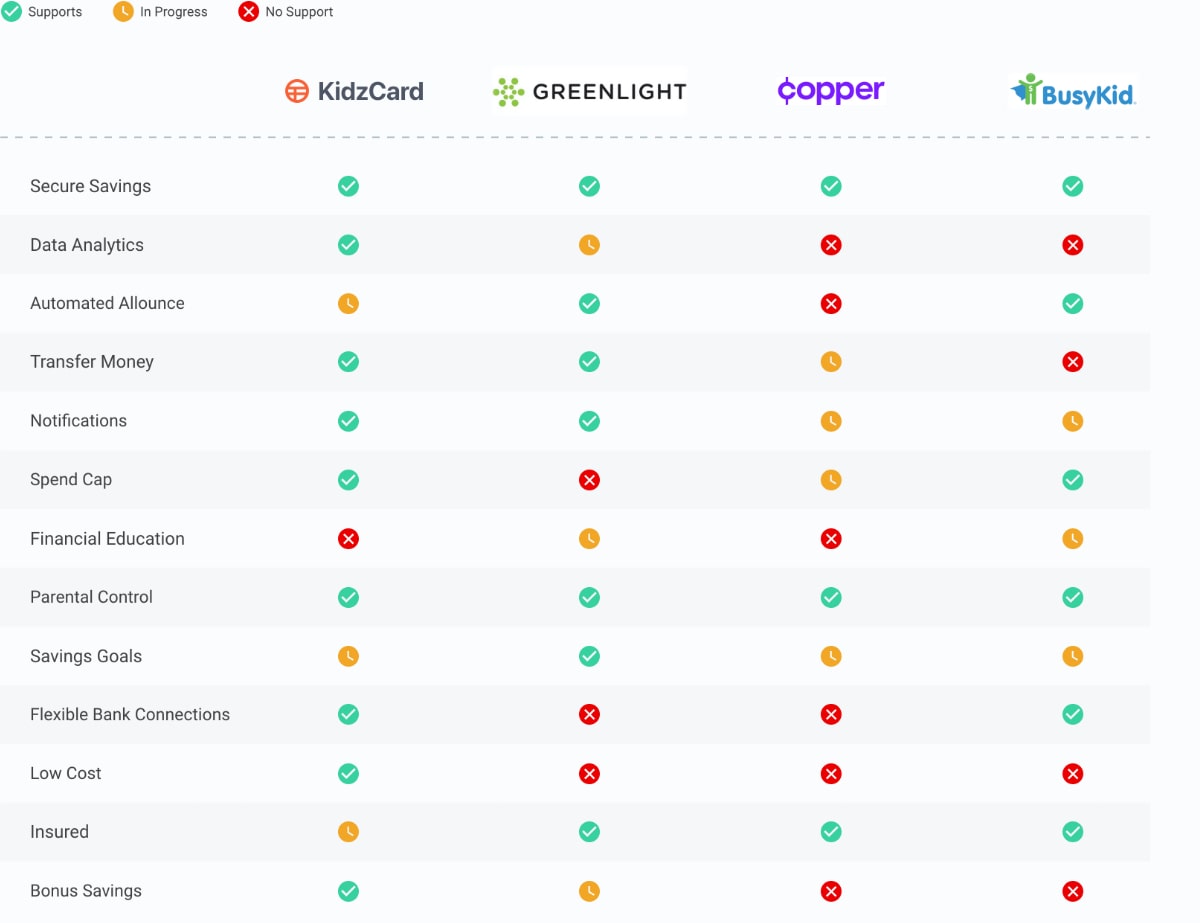
Competitor Analysis
The competitor analysis was used to compare Kidzcard against the primary features competitors provide.
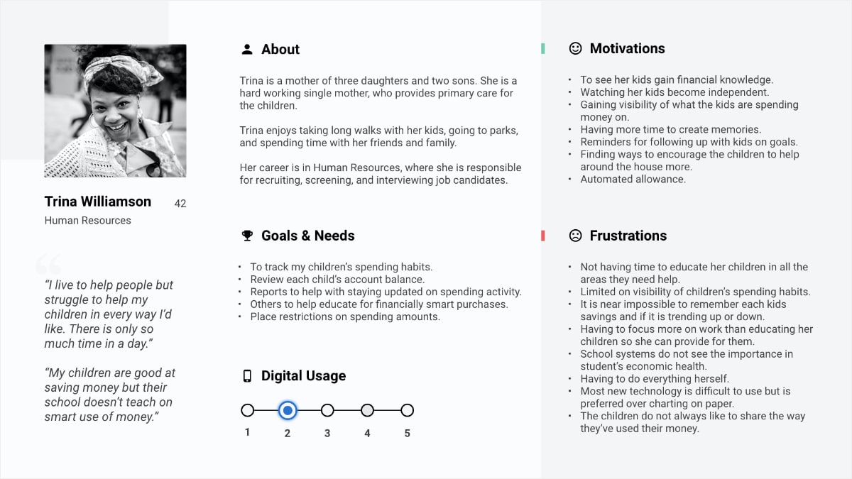
User Personas
I created user personas as a reference for our customer types and their needs. They were used to help make difficult decisions and make sure the team was putting customers first.

Journey Map
A journey map was created through a workshop I conducted with partners. The journey map helped stakeholders understand the different processes parents and children use to earn, receive, and spend money.

Brainstorm
I held brainstorm sessions and uncovered key opportunities:
Awareness
How might we keep parents informed and still provide the kids with a sense of privacy?
Educate
How might we we educate the kids and parents? What is the optimal way to prevent learning material from becoming outdated?
Appeal
What can we do to make the product appealing to parents and their children? How can we make it essential?
Measurement
Can we show growth in independence? What are ways we can measure performance? How do we bring visibility to the users return on investment (ROI)?
The knowledge and ideas were packaged and used to foster visual exploration.
Design
I mapped out the architecture, created wireframes, established a brand style, created concepts, and built a prototype, while pulling in the right partners through the process.
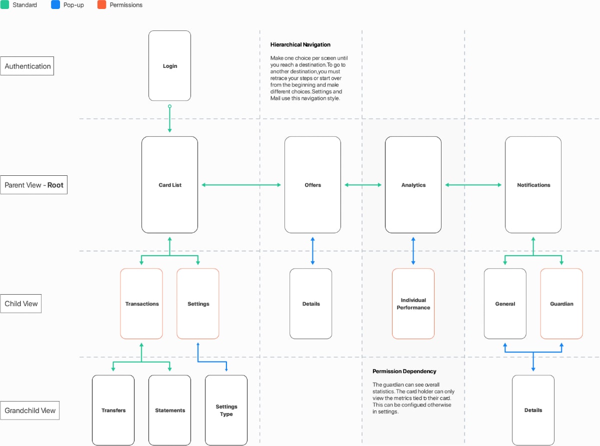
Information Architecture
With the use of requirements and the project roadmap, I categorized features and a flow diagram for the application.
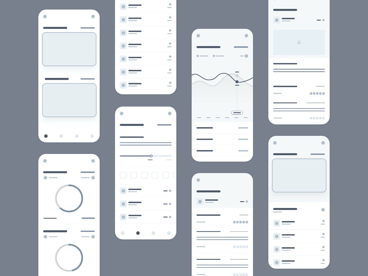
Wireframes
Wireframes were created to understand the layout and functionality of the application. They were shared with stakeholders, where feedback was provided without the distraction of colors, words, or other embellishments.
Risks were surfaced, such as cognitive overload on the analytics page and confusing text hierarchy on other pages.
After refinement and getting stakeholder buy-in, I worked toward setting the right tone for the product.
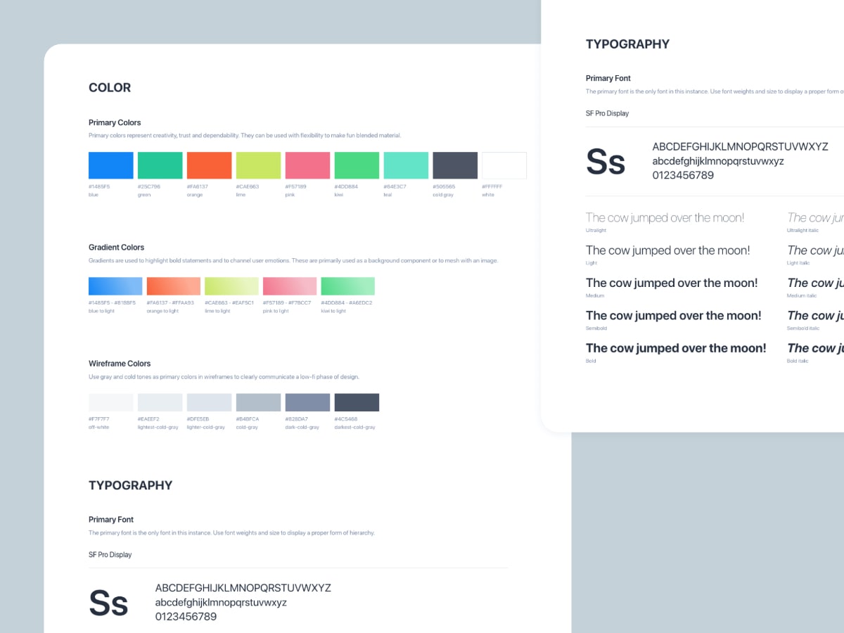
Brand
Multiple color schemes were created and reviewed. The team aligned a vibrant brand to help encourage energy, activity, and entertain an educational experience.
Concepts
High fidelity concepts were presented to stakeholders and customers. With more refinement, we reached our minimum viable product (MVP).
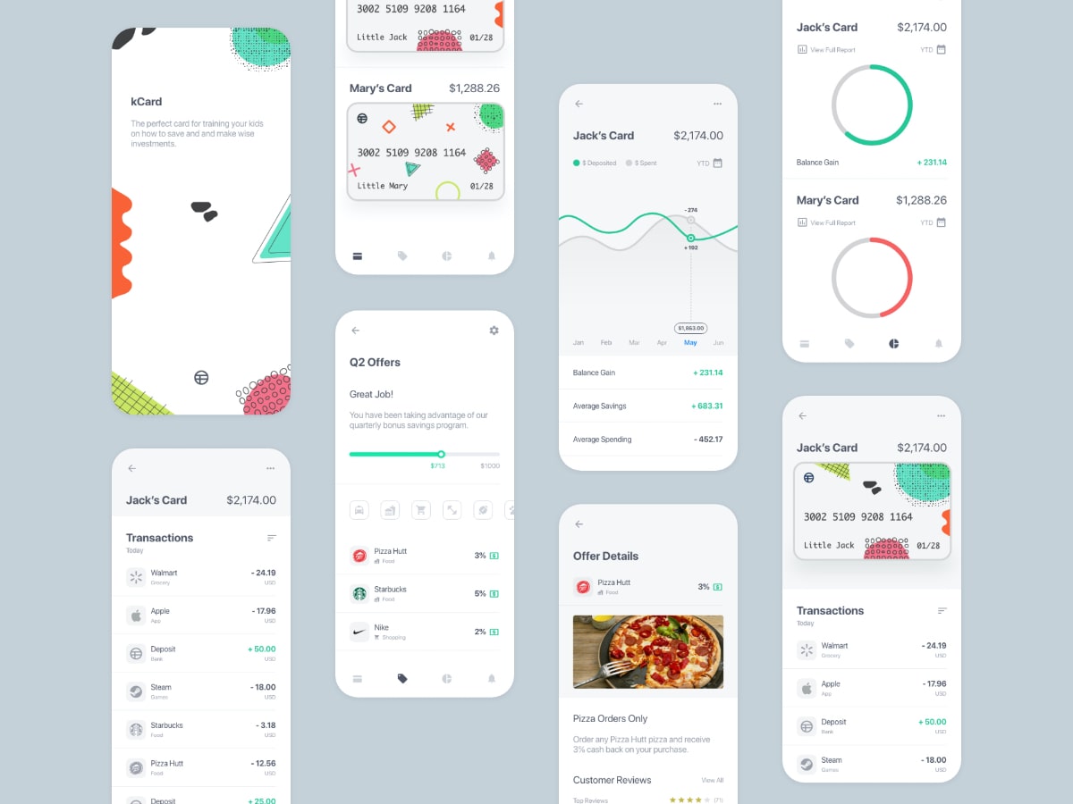
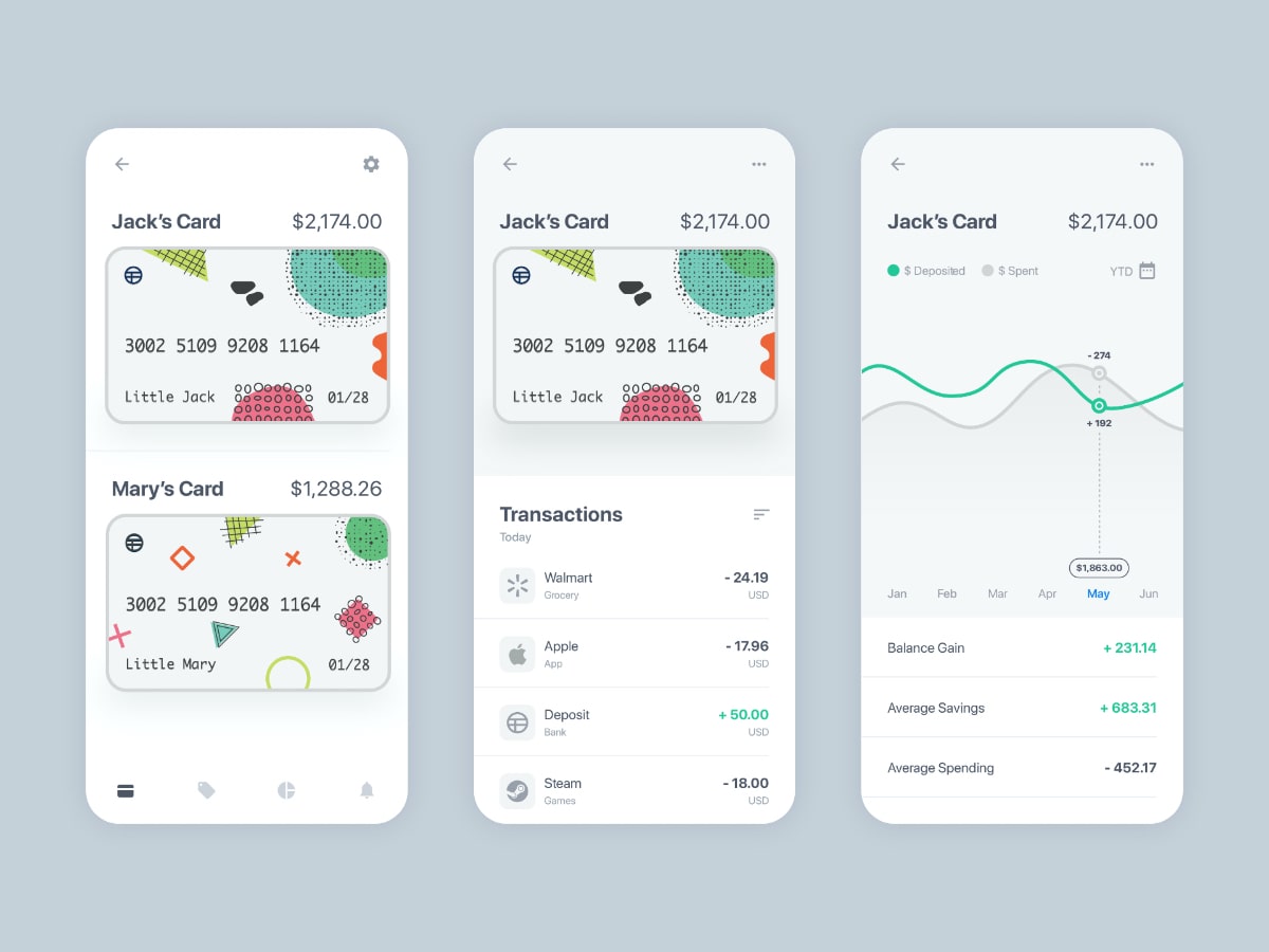
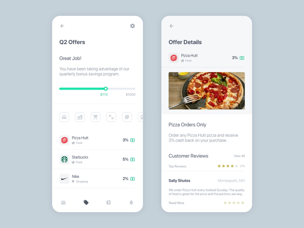
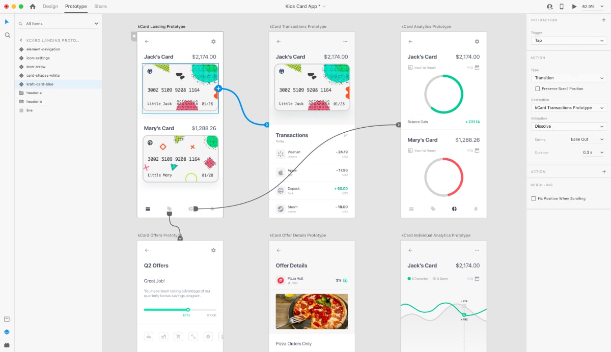
Prototype
Concepts were used to create a prototype and the prototype was accesible to cell phones as something tangible for stakeholders to test.
After iterating, we reached a dev ready status, we met a sad ending, where the client needed to pause the project for confidential reasons. Despite the pause, we celebrated and plan to revisit the product in the future.
Learnings
There were failures and lessons learned. Below are challenges I worked through that helped me grow as a designer:
Less is more
One of my top 5 strenths is being analytical. I want as much information as I can get my hands on. That is not the case for our audience. Only specific information is meaningful. Reducing cognitive load and the amount of information on the screen is more important to our users.
Break the ice
The kickoff meeting was exciting and the team was fully engaged. A few review sessions in and our gatherings started to feel dry. People were drifting. We made it a goal to start meetings with ice breakers and include short interactive games. Attendance climbed and the conversations became much more impactful.