Stryker
AcuteCare Application
I led the design of Stryker's AcuteCare application including research, defining the design strategy, usability testing, development handoff, and quality assurance testing. The AcuteCare app helps clinicians improve care coordination and speed to treat patients.
I presented concepts to Senior Leadership, our Technology Director, and CIO. A beta version of the app launched in multiple hospitals.
My Role
UX Design
Team Size
25-30 Memebers
Timeline
14 Months
My Role
UX Design
Team Size
25-30 Memebers
Timeline
14 Months
Product Details
The AcuteCare app is a HIPAA-compliant platform providing clinicians with tools to improve care coordination for all disease types. My team aligned on prioritizing Stroke care as the first form of optimized care, given stroke ranks as the second leading cause of death worldwide and is a major contributor to disability.
Problem
The complexity of EHR systems, radio calls, and a dynamic environment makes it difficult to communicate. Urgency is a key factor in patient outcomes—every minute a stroke is untreated, the average patient loses 1.9 million neurons. Additionally, many hospitals don't measure team performance. therefore, are blind to opportunities to improve the care process.
1
Communication
2
Urgency
3
Performance
Solution
Enable EMS to alert and share ETA and patient information electronically so the hospital can better prepare for patients. Digitizing the care process allows clinicians to easily record all activity, automate reporting, and treat patients more efficiently with more visibility. AcuteCare will also capture metrics and give hospital admins the ability to set team performance goals.
1
Digital
2
Efficiency
3
Goals
Research
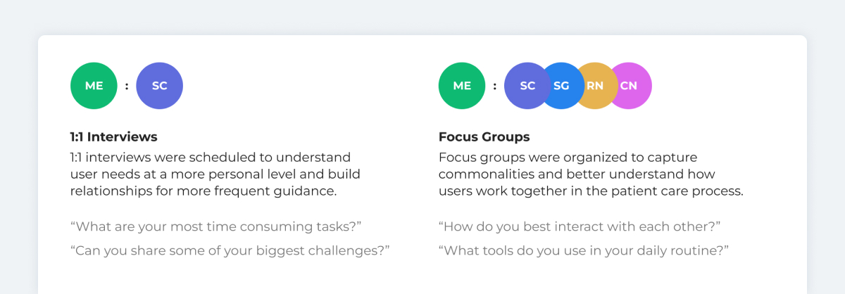
Interviews
To understand our customer, I conducted interviews with 100+ clinicians globally, documented opportunities, and shared insights with AcuteCare stakeholders.
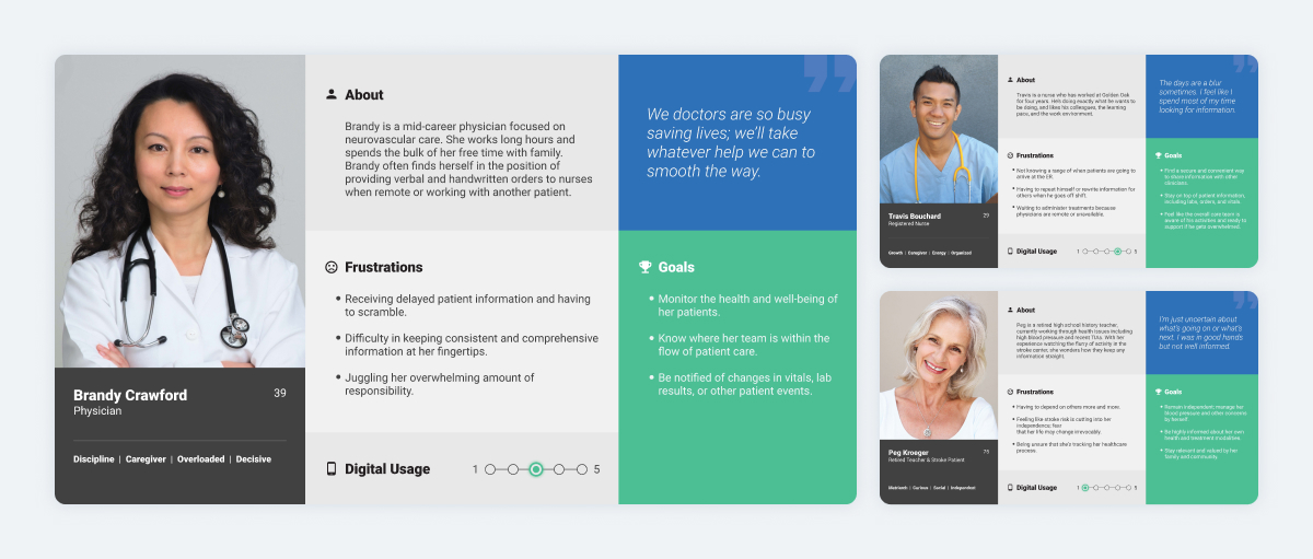
User Personas
I used information gathered from research to create user personas representing our main target audience and their needs. Personas were used to educate our product stakeholders, setting feature prioritization, and aiding design decisions.
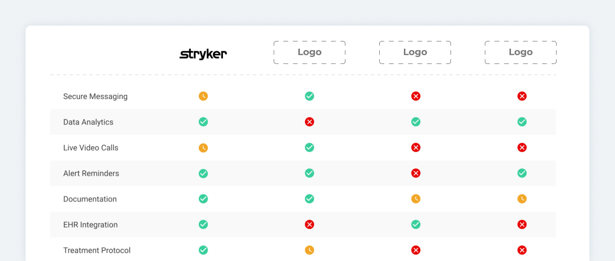
Competitor Analysis
My analysis was used to capture our key differentiators, find our niche in the market, align partner teams on a business strategy, and help prioritize our most impactful features.
Design
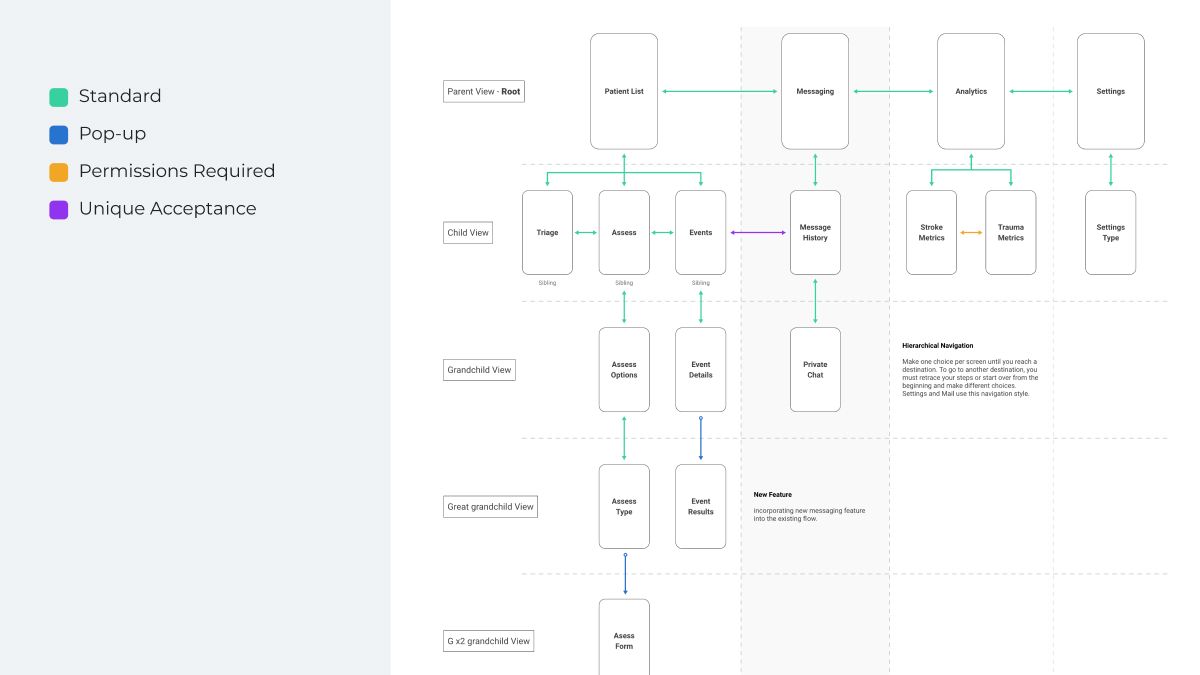
Information Architecture
I recommended, tested, and validated hierarchical navigation would work best for our solution due to speed, flexibility, and most clinicians using iOS devices.
Wireframes
I created a skeletal framework to explore the layout of information, define functionality and share ideas with core stakeholders.
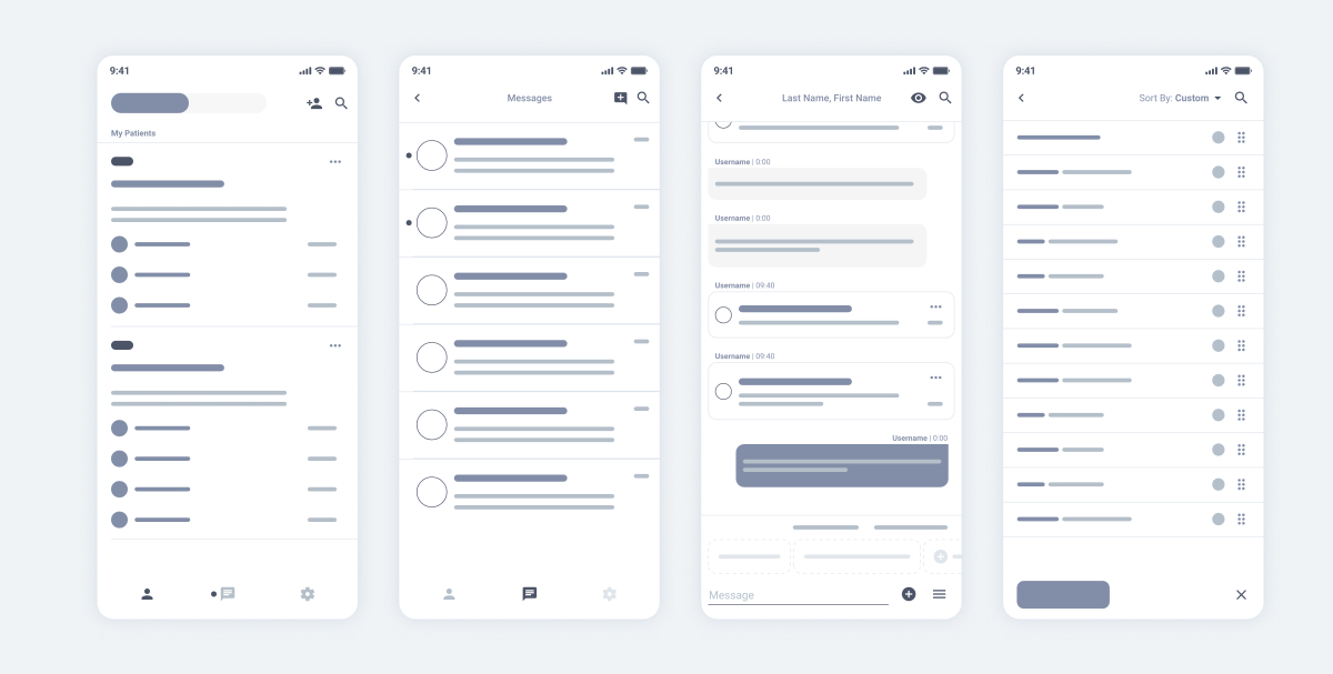
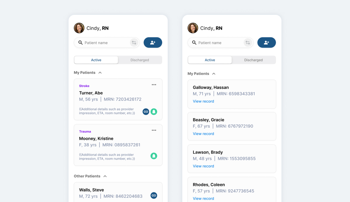
Home Page
The home page includes all relevant patients in the hospital. It was created for care coordinators to easily identify their patients and where they're at in the stroke care journey. Swiping left or tapping on the "Discharged" tab are quick actions for clinicians returning to shift to view a previous patients record.
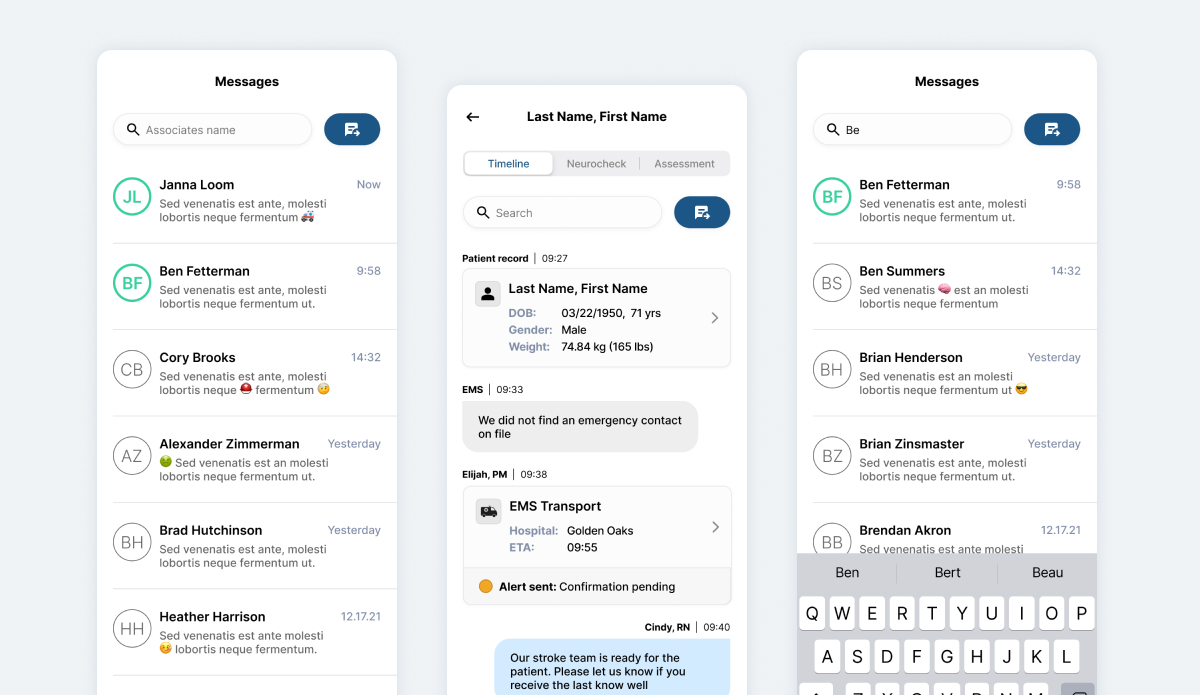
Communication
Standard conventions were implemented for basic messaging and an innovative and more robust form of messaging was designed to track patients care journey. Knowing the importance of urgency, I created predefined communication actions for one-tap updates.
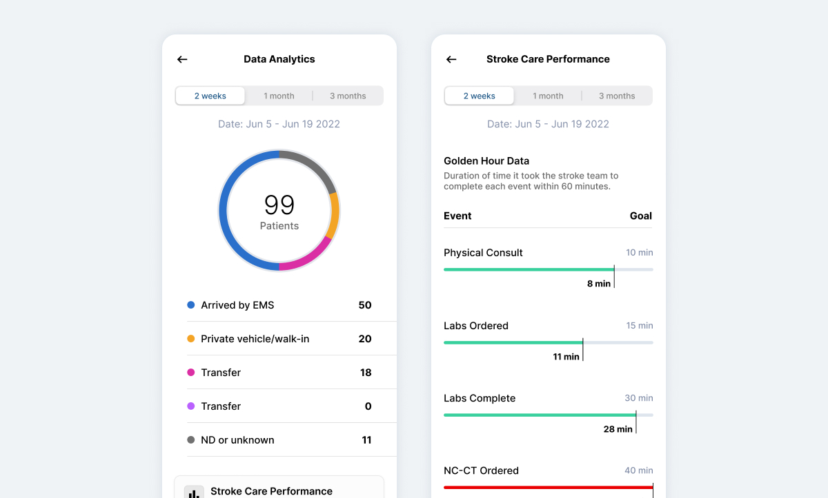
Analytics
Analytics: Admins needed access to analytics to share performance with clinical teams. In my discovery phase, I learned most users wanted to see the data and thought it would encourage individual performance improvement.
Analytics were strategically limited to high-level information that could be accessed or filtered with a single tap on mobile and a more robust version was designed for Desktop.
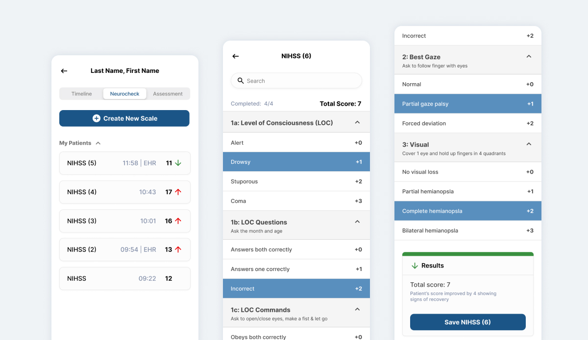
Stroke Scale
Clinicians use and NIH Stroke Scale to assess the severity of patients. Discovering most scales were completed on paper, I recommended implementing a digital scale to simplify inputs and send information directly to the patients Electronic Health Record (EHR).
Testing
Usability Testing
I created multiple study brief and conducted user tests to ensure we were building optimal features. I used a third party app for A/B tests and learn how customers could best utilize our app to optimize speed and accuracy of communication.
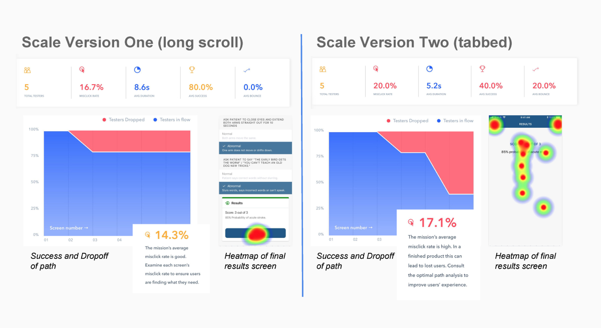
One test consisted of measuring the use of our digital NIH Stroke Scale feature (pictured below). Customers completed different variants of the scale and I used the data and heat maps to align stakeholders on the design decision.
Results
Beta Launch
We launched a beta version of our AcuteCare Application app in multiple hospitals and metrics are still being measured. Users have communicated significant improvements in their workflow and communication.
This is a condensed view of my case study. If you'd like to learn more about this project or my design process, contact me.